How to Edit Photos in Lightroom in 2026: Complete Editing Guide
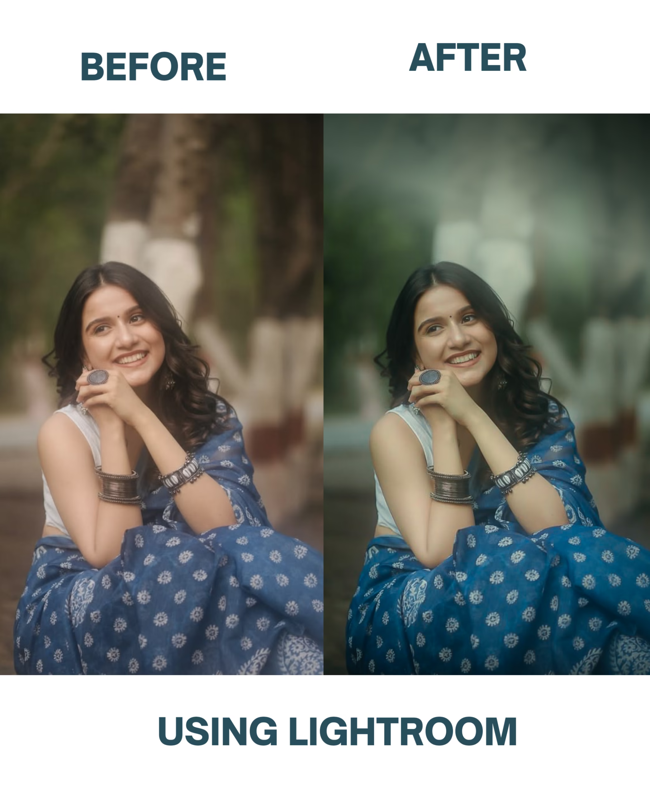
Photography is no longer just about clicking a button on a DSLR or a modern smartphone. In today’s digital era, where millions of images are shared across social media every single second, capturing a raw photo is only half the job. The real magic happens during post-production. Whether you are editing landscape photography, portraits, street shots, or moody aesthetic feeds, mastering Lightroom photo editing is what transforms a flat, ordinary image into a striking piece of visual art.
If you have ever wondered how professional photographers achieve that crisp, cinematic, and perfectly balanced look in their photos, the secret isn’t an expensive camera sensor alone. It is a deep understanding of light, color theory, global vs. local adjustments, and purposeful workflow management.
In this comprehensive guide, we will break down the exact framework, techniques, and insider workflows to edit photos in Lightroom like a professional in 2026.
1. The Foundation: Understanding the Lightroom Workflow
Before sliding random adjustment bars back and forth, you need a disciplined editing workflow. Amateurs tend to jump straight into creative filters, while professionals follow a systematic path from correction to creation.
- The Corrective Stage: Fix technical flaws first. Correct your exposure, white balance, lens corrections, and perspective distortions.
- The Creative Stage: Once the foundation is solid, move on to color grading, tone curves, and localized masking to build your unique mood.
[Screenshot Suggestion: Add a clean screenshot of the Lightroom Desktop or Mobile interface showing the Develop Module with the Basic panel expanded.]

2. Mastering Global Adjustments (The Basic Panel)
The Basic panel is where 80% of your photo’s heavy lifting happens. Getting these sliders right determines whether your image looks natural or overly processed.
- Exposure & Contrast: Adjust overall brightness carefully. Use the contrast slider to add punch, but watch out for clipping the shadows and highlights.
- Highlights and Whites: Pull down your highlights to recover lost sky details or bright reflections. Push up your whites slightly to add sparkle to the image.
- Shadows and Blacks: Open up your shadows to reveal hidden textures in dark areas, but don’t lift them so much that the image becomes washed out and loses depth.
- Texture, Clarity, and Dehaze: Use texture for subtle skin or fabric details, clarity for mid-tone contrast, and dehaze to cut through atmospheric haze in outdoor shots.
My Personal Experience: Early in my editing journey, I used to abuse the “Clarity” and “Dehaze” sliders, cranking them all the way up on every single photo because I thought it made details pop. The result? Horrible, muddy halos around edges and skin that looked like sandpaper. It took me ruining dozens of portraits to realize that Lightroom sliders are like spices in a recipe—a tiny pinch makes the meal, but too much ruins everything. Now, I keep my clarity adjustments subtle and focus heavily on tonal balance instead.
3. Precision Editing with Masking (The Secret to Pro Looks)
Global sliders affect the entire image, but Masking is what separates beginner edits from professional masterpieces. Masking allows you to target specific areas of your photo without affecting the rest.
- Subject Selection: Use AI-powered Select Subject tools to instantly isolate your person or object and brighten them up against a darker background.
- Sky Masking: Select the sky to add dramatic contrast, warmth, or moody gradients.
- Linear and Radial Gradients: Use gradients to draw the viewer’s eye naturally toward the focal point of your image (vignetting or lighting direction).
[Screenshot Suggestion: Take a screenshot of the Lightroom Masking panel showing an active brush or subject mask with the red overlay mask visible.]
4. Color Grading and Tone Curves
Color is the ultimate emotional driver in photography. If you want your photos to have a distinct signature look, you must master the Tone Curve and Color Mixer.

- The RGB Tone Curve: Shape your contrast precisely by using an S-curve. Slightly lifting the blacks gives your images a trendy, matte film look.
- Color Mixer / HSL: Control the Hue, Saturation, and Luminance of individual colors. For instance, shifting orange luminance can completely change skin tones, while desaturating distracting background greens makes your subject stand out.
- Color Grading Wheel: Add specialized color tints to your Shadows, Midtones, and Highlights (such as the classic teal-and-orange cinematic look).
My Personal Experience: I remember spending hours trying to match popular Instagram preset packs, only to find they looked completely broken on my specific lighting conditions. It was frustrating because indoor shots looked yellow and outdoor shots looked radioactive. The turning point came when I stopped relying on blind presets and learned how to use the HSL panel and Tone Curve manually. Once I understood how tweaking individual color channels could save a broken sunset photo, my editing confidence skyrocketed.
5. Export Settings for Maximum Quality
Even if your edit looks stunning inside Lightroom, poor export settings can ruin your image when uploaded to web or social media.
- File Format: Always export as JPEG (for web/social) or TIFF (for archiving/printing).
- Color Space: Set your color space to sRGB for all web and mobile sharing to prevent washed-out colors on different screens.
- Output Sharpening: Check “Sharpen For” and select Screen with Standard amount to keep your image crisp after compression.
Conclusion
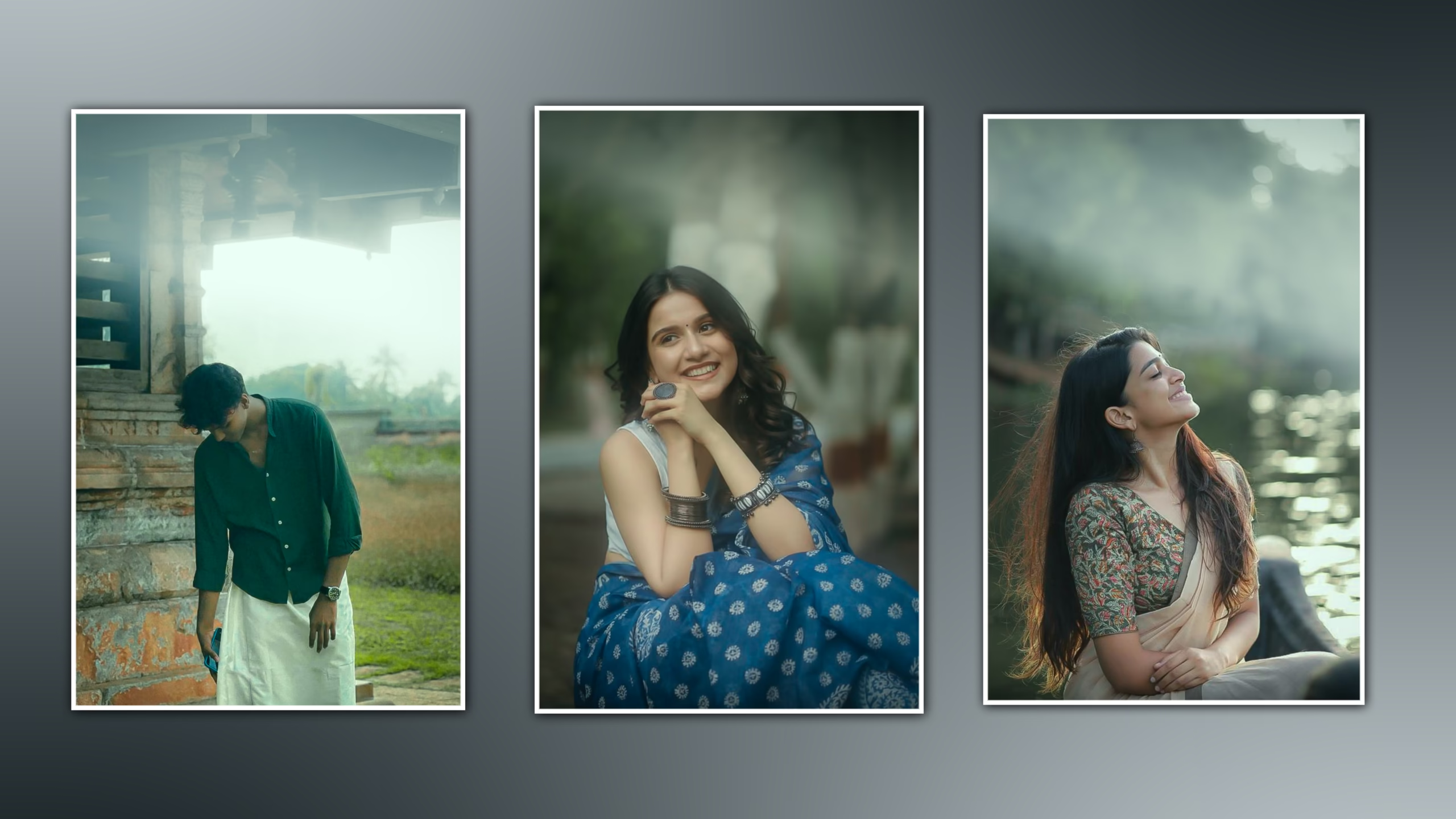
Mastering Lightroom photo editing takes patience, practice, and a clear understanding of light and color. Stop relying on heavy, uncustomized presets, and start focusing on foundational exposure, precise masking, and thoughtful color grading.
Start applying these techniques to your raw files today, and watch how your photography transforms from simple snapshots into professional visual stories.