How to Create a Professional Birthday Poster on Your Phone: Step-by-Step Editing Guide
Creating a professional birthday poster on a phone does not require dozens of effects. The quality of the final design mainly depends on photo selection, composition, typography, lighting, color balance, and visual hierarchy.
A good birthday poster should make three things immediately clear: who the poster is for, what the occasion is, and where the viewer should look first.
This guide provides a practical mobile workflow with useful starting values for creating a clean and professional birthday poster.
1. Choose a High-Quality Photo
Start with the best original photo available.
Look for:
- Clear facial details
- Good lighting
- Minimal blur
- A suitable pose
- Enough space around the subject
- Visible clothing details
Avoid screenshots or heavily compressed images when possible.
Useful rule:
Better source photo → less correction → better final design.
Editing cannot completely recover a severely blurred or poorly exposed image, so photo selection should come first.
2. Set the Correct Canvas Size
Choose the canvas according to where the poster will be published.
| Platform | Recommended Size | Ratio |
|---|---|---|
| Instagram Portrait | 1080 × 1350 px | 4:5 |
| Instagram Story | 1080 × 1920 px | 9:16 |
| WhatsApp Status | 1080 × 1920 px | 9:16 |
| Square Post | 1080 × 1080 px | 1:1 |
For a standard portrait birthday poster, 1080 × 1350 px is a practical choice.
Keep important text and design elements approximately 5–8% away from the canvas edges so the design does not feel cramped.
3. Build the Composition First
Decide where the important elements will go before adding effects.
A simple hierarchy is:
Person → Birthday Message → Name → Supporting Text → Decorations
For example:
Top: HAPPY BIRTHDAY
Center: Main portrait
Lower section: Name
Bottom: Short supporting message
The arrangement can change depending on the photo, but the main subject and birthday message should remain easy to identify.
4. Remove the Background Carefully
A clean subject cutout can make the poster look much more professional.
After removing the background, inspect:
- Hair
- Shoulders
- Fingers
- Clothing edges
- Accessories
- Areas around the head
Avoid strong outlines around the person.
If your editing app provides feathering or edge softness, start around 1–3 px at 1080 px output and adjust according to the image.
The edge should blend into the background without looking visibly blurred.
5. Create a Controlled Background
The background should support the subject instead of competing with it.
Useful options include:
- Smooth gradients
- Subtle textures
- Blurred shapes
- Soft bokeh
- Controlled light
- Low-opacity decorative elements
A simple color system is usually enough:
2 main colors + 1 optional accent
Examples:
- Deep blue + gold
- Purple + pink
- Cream + orange
- Black + red
Avoid combining several unrelated colors simply to make the poster more colorful.
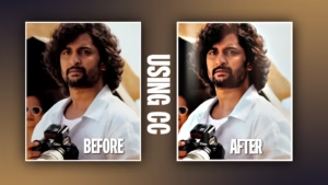
6. Correct the Portrait Before Adding Effects
Perform basic correction before creative styling.
For a normally exposed portrait, these can be useful starting points:
| Adjustment | Starting Range |
|---|---|
| Exposure | +0.1 to +0.3 |
| Contrast | +5 to +12 |
| Highlights | −10 to −25 |
| Shadows | +10 to +25 |
| Saturation | 0 to +8 |
| Sharpening | +5 to +15 |
These are starting values, not fixed settings.
If the photo is already bright, increasing exposure can remove facial and clothing details. Adjust according to the original image.
The target is:
Clear face + controlled highlights + natural skin + visible details
7. Keep Skin Natural
Avoid excessive face processing, especially on birthday portraits.

Do not overuse:
- Skin smoothing
- Whitening
- Orange color tones
- HDR
- Sharpening
Make small corrections and compare the edited face with the original.
The skin should remain natural rather than looking artificially processed.
8. Add Depth With Shadow and Light
A cutout can look pasted onto the background if there is no visual separation.
For a 1080 px poster, a subtle subject shadow can start around:
- Opacity: 15–30%
- Blur: 15–30 px
- Distance: 5–15 px
Adjust these values according to the background.
You can also add a soft light behind the subject, particularly around the head or shoulders.
Keep the light subtle. It should separate the subject without becoming brighter than the face.
9. Design the Typography
Typography should be easy to read and visually organized.
Usually, two font styles are enough:
- One for the birthday message
- One for the person’s name or supporting text
For example:
HAPPY BIRTHDAY
ARJUN
Use a clean bold font for the main message and a complementary display font for the name.
Text hierarchy
Main heading: Largest
Name: Strong secondary element
Supporting text: Smaller
Do not make every text element equally large.
10. Control Letter and Line Spacing
Font selection alone does not determine how professional typography looks.
Useful starting points:
- Uppercase heading tracking: +5 to +15
- Normal text tracking: 0 to +5
- Line height: approximately 110–130%
Adjust visually according to the font.
If the heading feels crowded, increase spacing slightly. If it looks disconnected, reduce it.
11. Add Decorations With a Purpose
Birthday posters can use balloons, confetti, particles, flowers, ribbons, stars, or light elements.
Use decorations to:
- Balance empty space
- Frame the subject
- Support the theme
- Guide attention
- Fill intentional gaps
Keep decorations away from important facial features and text.
Simple rule:
If removing an element makes the poster clearer, that element probably was not necessary.
12. Use Glow and Effects Carefully
Glow and light effects can make important elements stand out, but applying them everywhere reduces clarity.
A simple combination could be:
Subject → subtle rim light
Name → light glow
Avoid applying strong glow, blur, shadows, particles, and borders to every element.
If the design already looks good with minimal effects, stop there.
13. Create a Clear Focal Point
The person’s face will usually be the main focal point.
Strengthen it by:
- Slightly darkening the background
- Increasing subject contrast
- Adding subtle rim light
- Keeping surrounding elements softer
- Avoiding text over the face
A useful visual principle is:
Sharp + bright + detailed = attention
Soft + darker + less detailed = background
This creates hierarchy without requiring excessive effects.
14. Align Every Element
Before exporting, check:

- Text alignment
- Name position
- Subject placement
- Margins
- Decoration spacing
- Canvas edges
Use alignment guides when available.
Small spacing inconsistencies can make an otherwise good poster feel unfinished.
15. Apply a Subtle Final Color Grade
Once the design is complete, use a light overall adjustment to make the elements feel connected.
Possible starting points:
- Contrast: +3 to +8
- Saturation: 0 to +5
- Highlights: −5 to −15
- Shadows: +5 to +10
Compare the result with the original.
If the color grade becomes obvious, reduce it. The purpose is to unify the design, not completely change the portrait.
16. Export at the Correct Quality
Use the correct dimensions for the target platform.
For JPEG:
Quality: 85–95%
For PNG:
Use it when you need strong graphic clarity or transparency.
Before uploading, check:
- Face clarity
- Text readability
- Cutout edges
- Small details
- Overall sharpness
17. Final Quality Check
Before publishing, quickly check:
Face: Natural and clear?
Text: Immediately readable?
Composition: Subject positioned correctly?
Colors: Working together?
Background: Supporting the subject?
Edges: Cutout looking natural?
Effects: Helping rather than distracting?
Export: Correct size and quality?
View the finished poster at normal phone size. If your attention jumps between unrelated elements, reduce or reposition them.
The design should have one clear visual priority.
Clean Mobile Birthday Poster Workflow
Use this order instead of adding effects randomly:
Select photo → Set canvas → Remove background → Build background → Correct portrait → Add depth → Create typography → Add limited decorations → Align elements → Color grade → Export → Final check
Following a fixed order helps prevent unnecessary editing and makes the process easier to repeat.
Common Mistakes to Avoid
Too many fonts
Two font styles are usually enough.
Too many effects
Effects should support the design, not become the main attraction.
Bright background
The background should not compete with the person’s face.
Over-edited face
Natural skin usually looks more professional than aggressive smoothing.
Poor spacing
Keep text and important elements away from the edges.
No visual hierarchy
The viewer should know what to look at first.
Overcrowded design
Empty space is useful. Not every part of the canvas needs an element.
Final Takeaway
A professional birthday poster can be created entirely on a phone by focusing on the fundamentals: a strong photo, correct canvas size, clean composition, controlled lighting, readable typography, natural skin, balanced colors, and purposeful effects.
The biggest improvement usually does not come from adding more effects. It comes from making better decisions about what deserves attention and what should be removed.
A strong birthday poster should feel clean, balanced, readable, and visually focused—not overloaded.
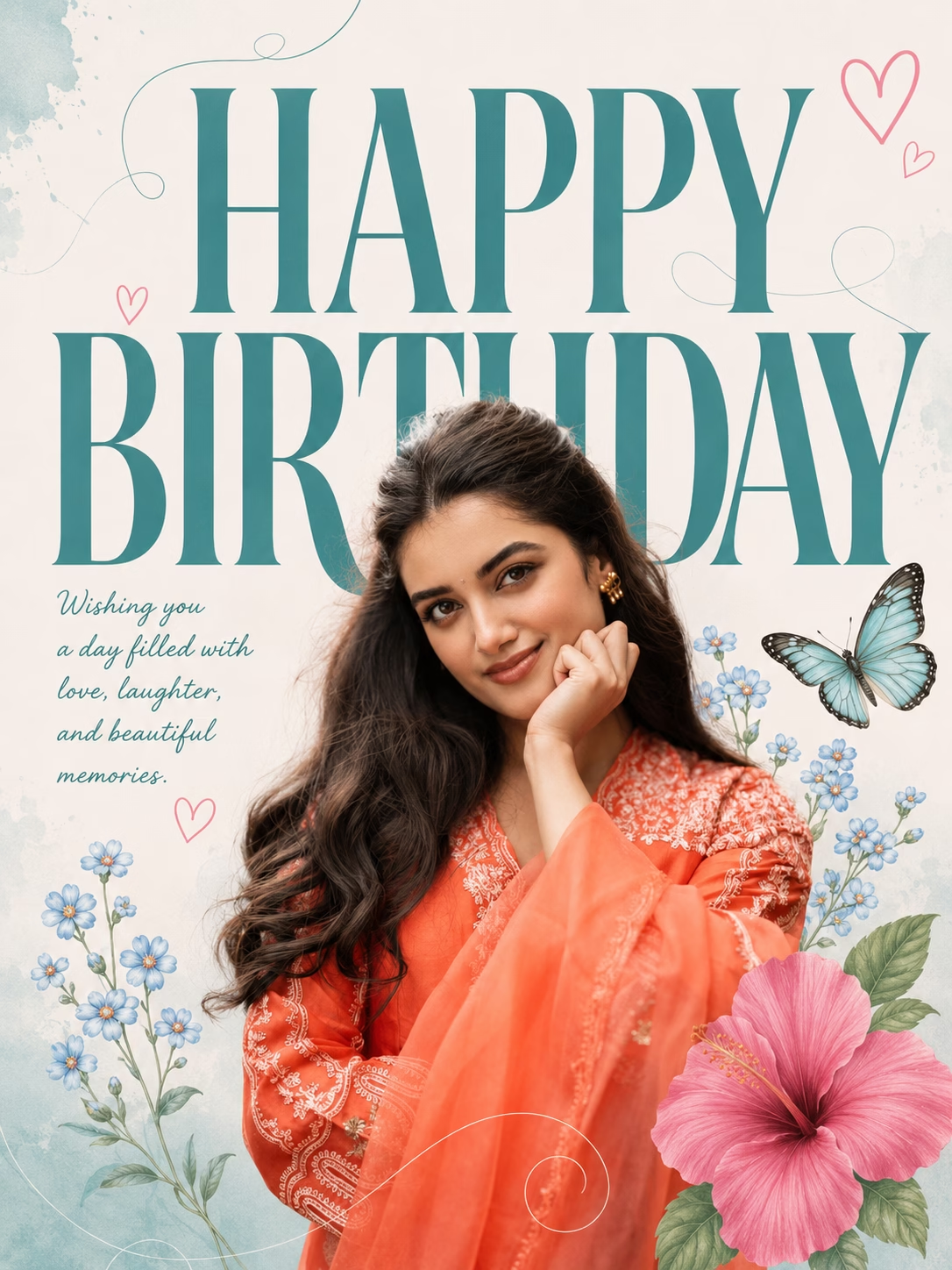
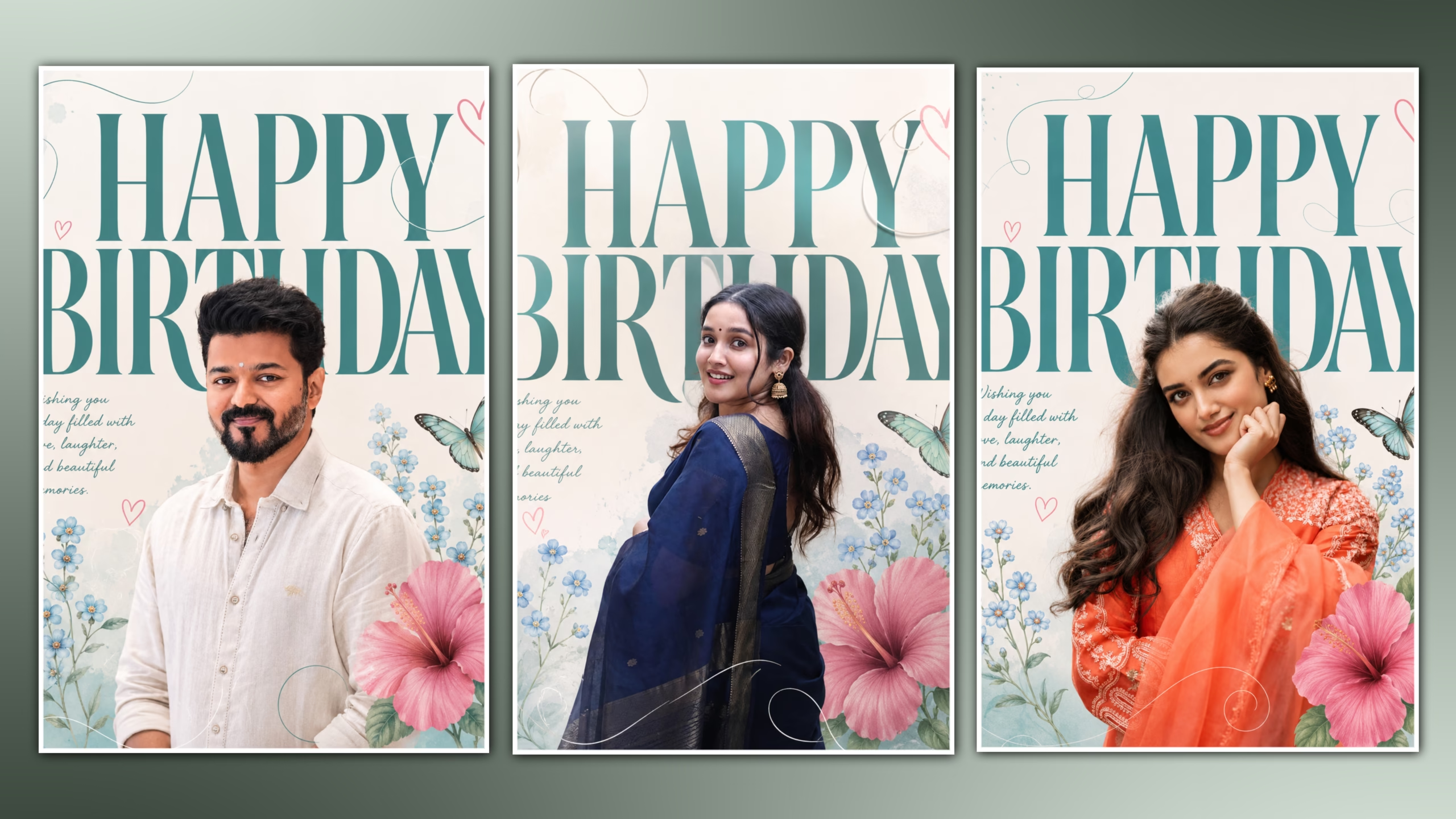
Create two different premium birthday poster featuring a young Indian in a ethnic outfit, standing in front of oversized teal “HAPPY BIRTHDAY”background. Add pastel floral illustrations, a pink hibiscus flower, blue forget-me-nos, delicate butterfly, heart doodles, and elegant curved line art. Use soft natural lighting, minimal aesthetic design, clean composition, high detail, Instagram-ready, 4:5 & 9:16 ratio.
(Give both poster separately)